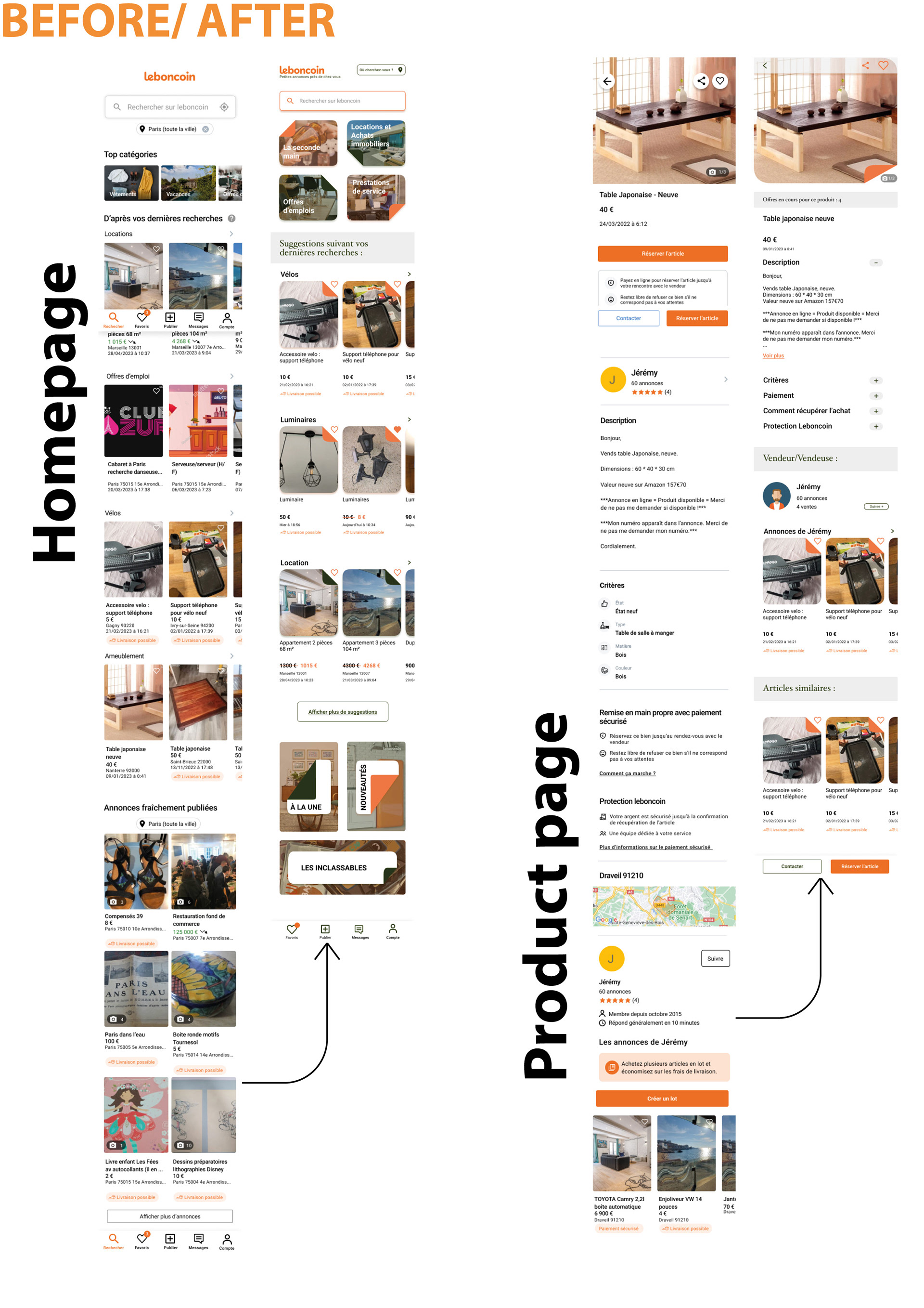

Leboncoin'app 2023 ©Google Play store
First of all, I felt that their current app wasn’t really visually optimized et didn’t match with their current brand identity. For this design critic, I was focus on the sell of products.
Heuristic
I started to replicate two screens that’s are the Homepage and the product page. Thanks to these clones, I realized that Leboncoin use one font that is not consistence as well, the categorization is not optimal and there are many repetition of information on each screen. Indeed this app is create for scrolling and find some treasures.
I did a quick research about the identity brand made by 4uatre Agency. Actually they include the blue as a primary color, there is more consistence in typography and the use shapes based on the logo.

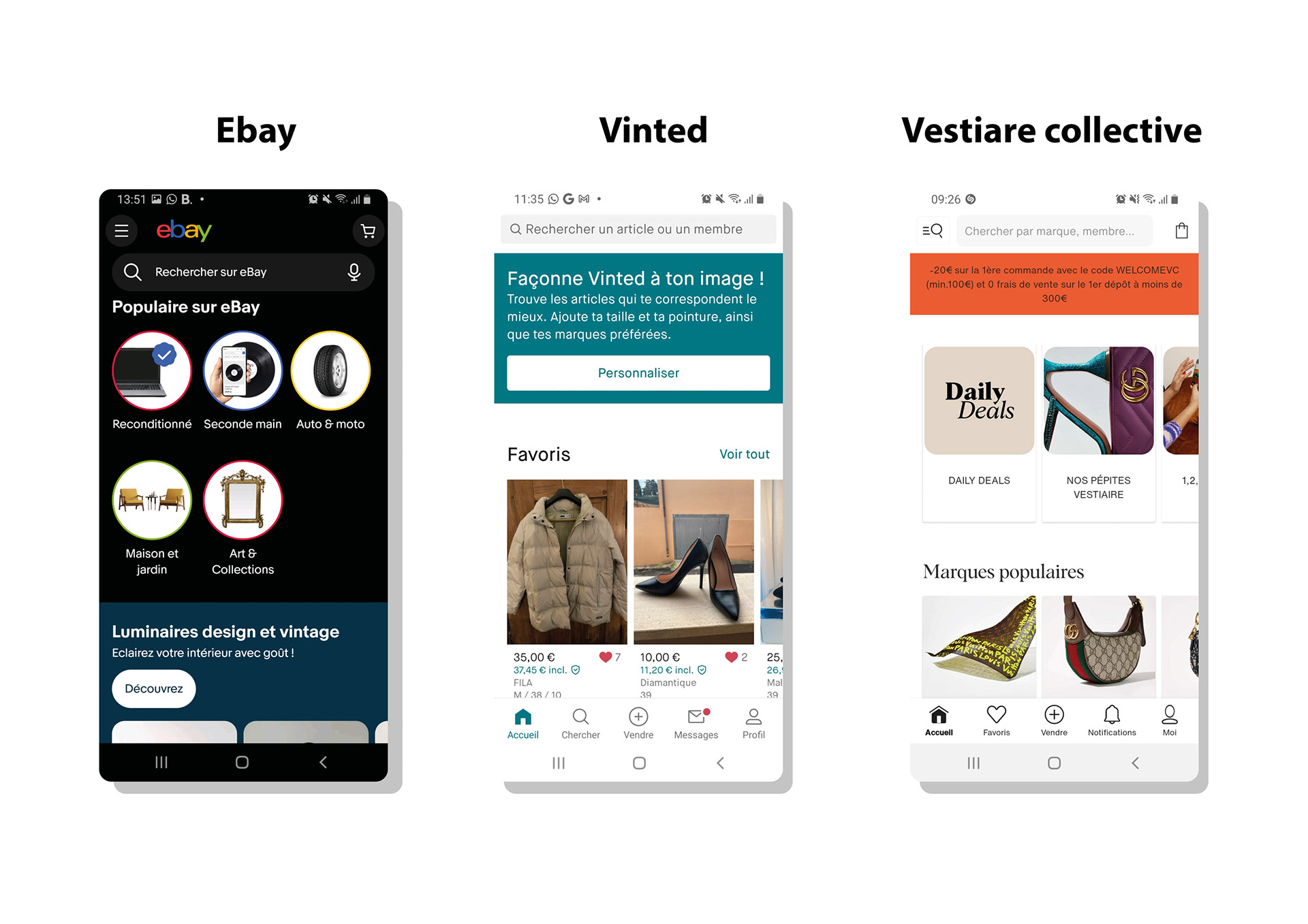
Competitor Analysis
The competitor of Leboncoin that I chose, in the part of the second hand, are Vinted, Vestiaire Collective and Ebay. I wanted to see how they managed with their brand identity and the accessibility for their users.
- Vinted use one primary color (same as the logo), and one secondary color. The consistency of the text is not relevant as much as Leboncoin. The brand identity is minimalist and simple.
- Vestiaire Collective use two primary color especially an orange one and black. The consistency of the texts is more precise as Leboncoin. The brand identity is minimalist, soft and elegant. Also, this brand is premium than Leboncoin.
- Ebay use one primary color (blue) and 5 secondaries that are relevant with the logo. The consistency of the text is not relevant as much as Leboncoin. About the brand identity, they develop some iconography that weights down the design.
Problematic and Ideation
At this point, I was wondering how can I include more identity and consistency in the app and how can I find a system for the categorization.
The objects selling on Leboncoin already had one life and I was looking for transcribe this value and highlight the objects left behind
©4uatre
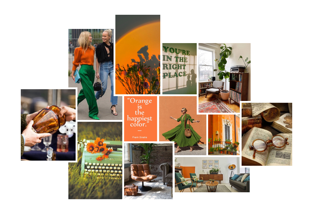
Moodboard
I picked up some adjectives to represent Leboncoin’s brand :
Vintage
Friendly
Second hand
Proximity
Ecologic
Experimentation
Leboncoin includes the term « corner ». It seems that the app allowed us to find all stuff we need with a good proximity. The French expression « le bon coin » can be translate as « a good deal ».
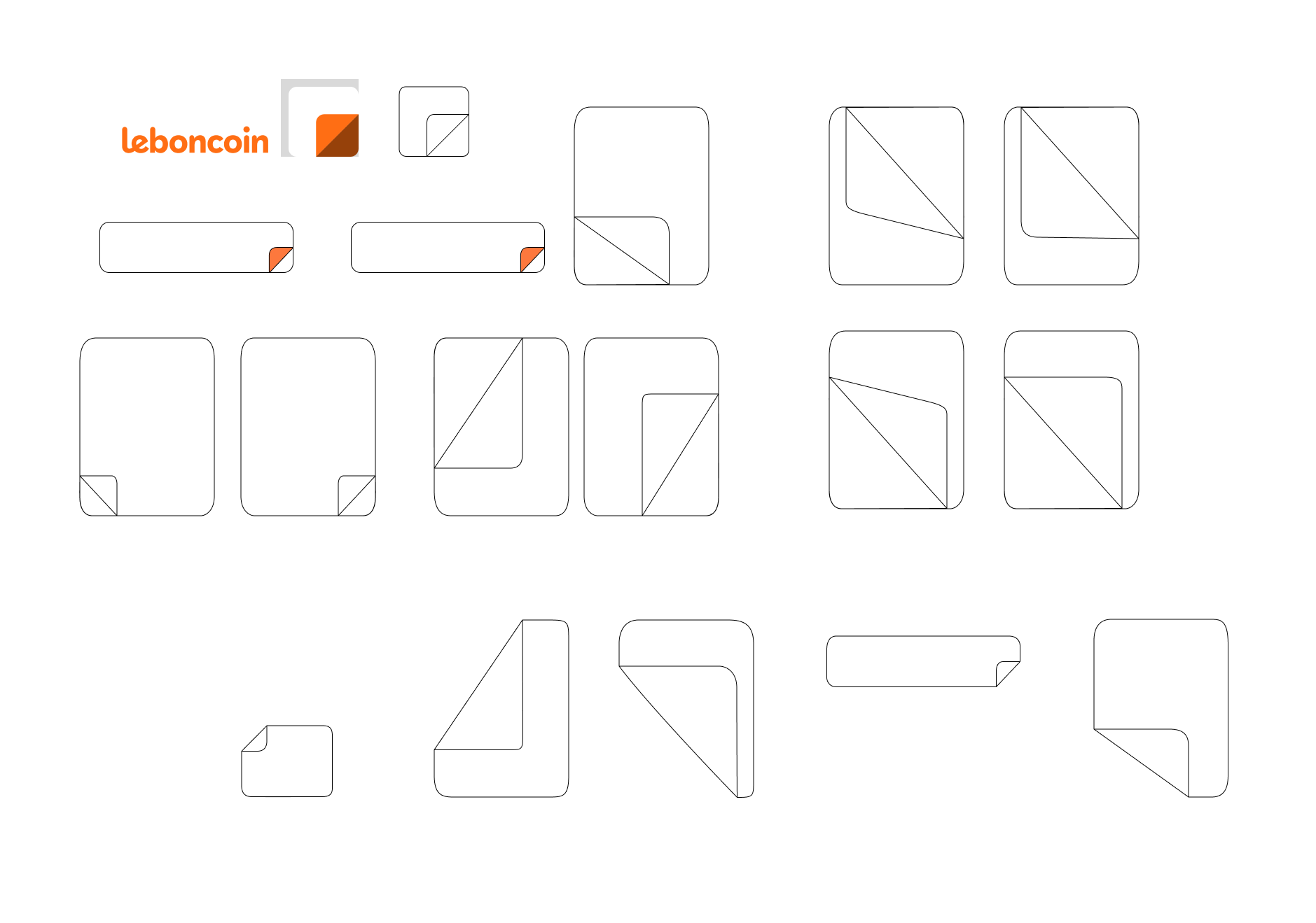

Currently, the corner is represented by the logo. I experimented some shapes including a corner to visualize the brand identity.
Thanks to these experimentations, I did a library of components based on these shapes and I was able to create my prototype.
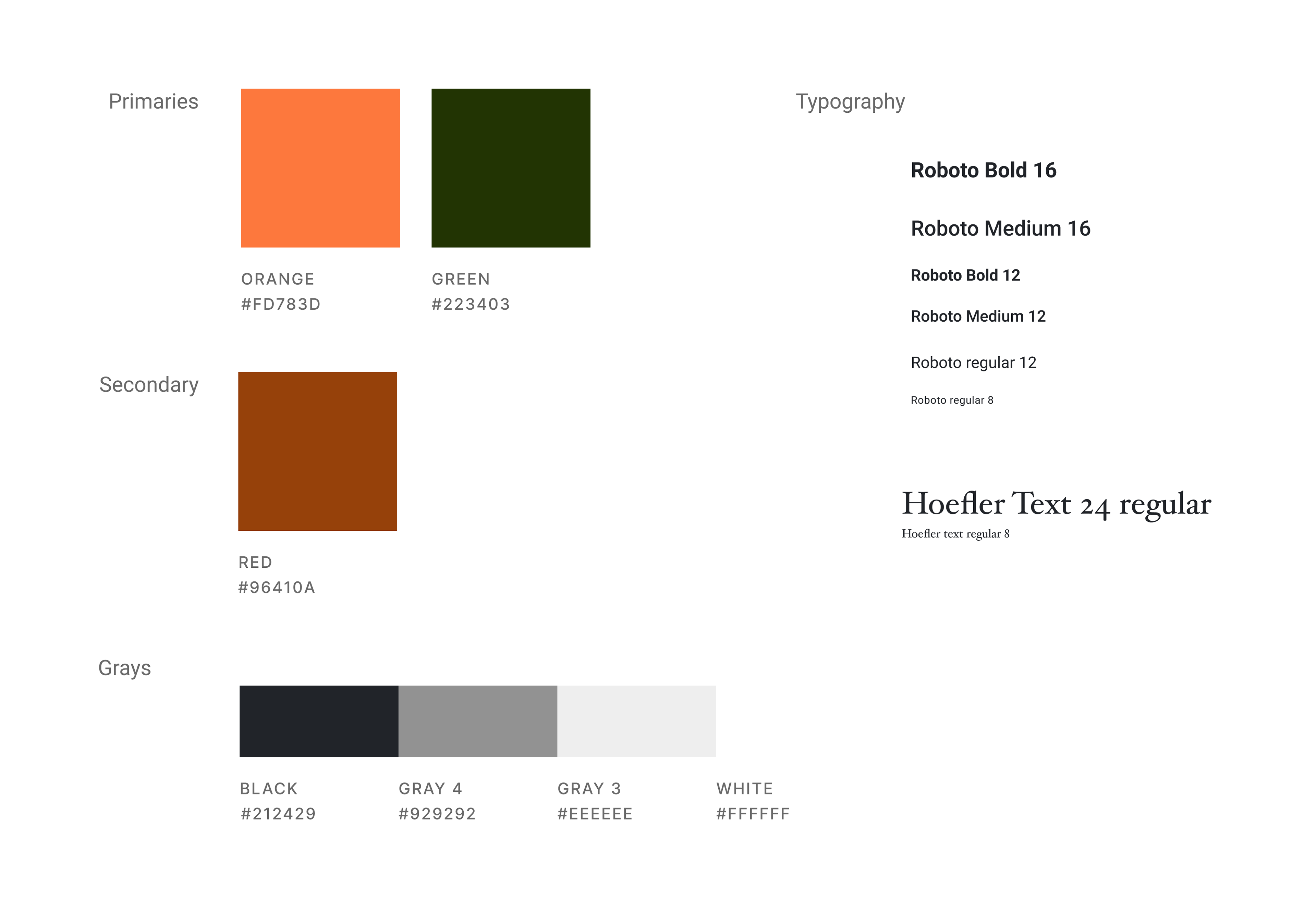
Style tile
For the pallet I chose the orange color that is characteristic of the brand. Starting from the principle that the brand added another primary color, I chose another primary color too that is different from their blue : it’s a forest green which empathizes the ecological aspect of the second hand.
I kept the original typography (Roboto) and I added a Serif Typo (Hoefler) to find the vintage aspect and old objects.
If you want to test my prototype you can click here
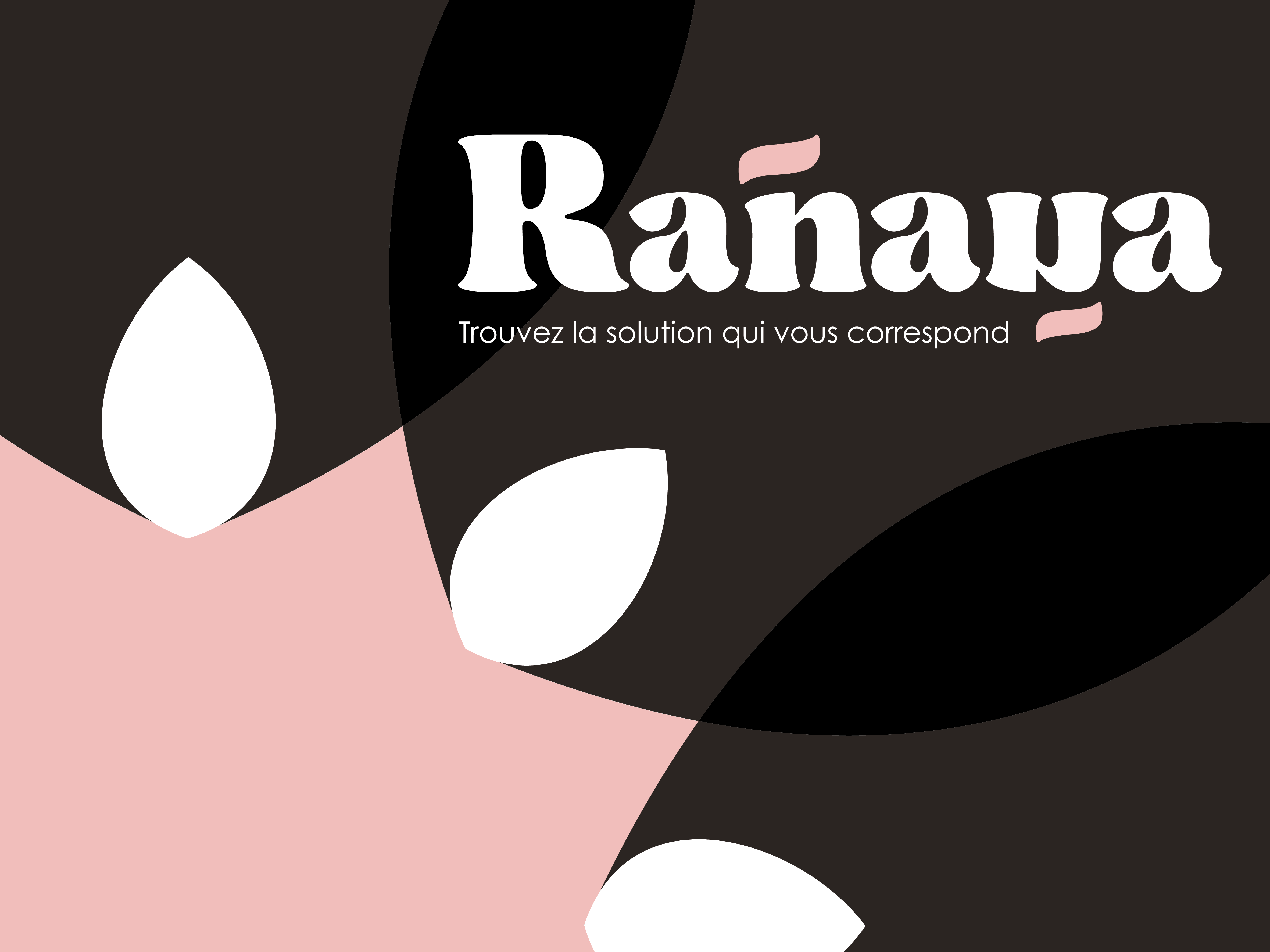
Hifi prototype
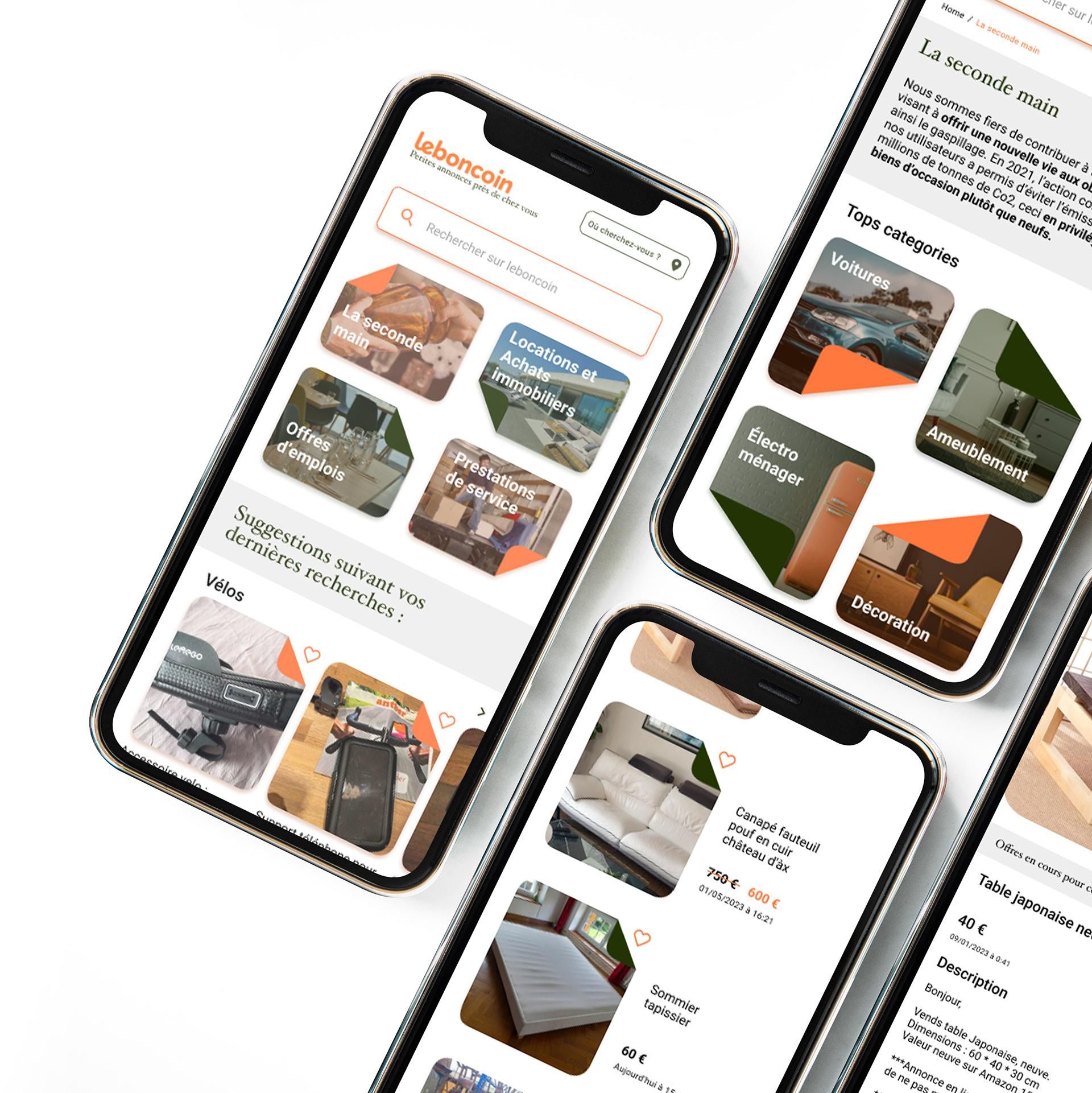
My prototype is presented as a treasure hunt. We navigate from screen to screen by doing a research with the process of a Russian doll. A huge category is composed by several other categories, composed by other several categories until we get the desired object that suits us.
The cards of categories are the results of my experimentations : they are in the form of a rectangle with rounded edges folded in one corner like the pages of a dog-eared book that is turned from chapter to chapter.

Next steps and conclusion
This project was really interesting to do. For the next steps, I’d like to experiment much as I do for other categories on Leboncoin (like the services, jobs and more). The second primary color that I chose could change in the different parts of the brand. Finally, this app deserves to have a marked and striking identity