Meet the artist
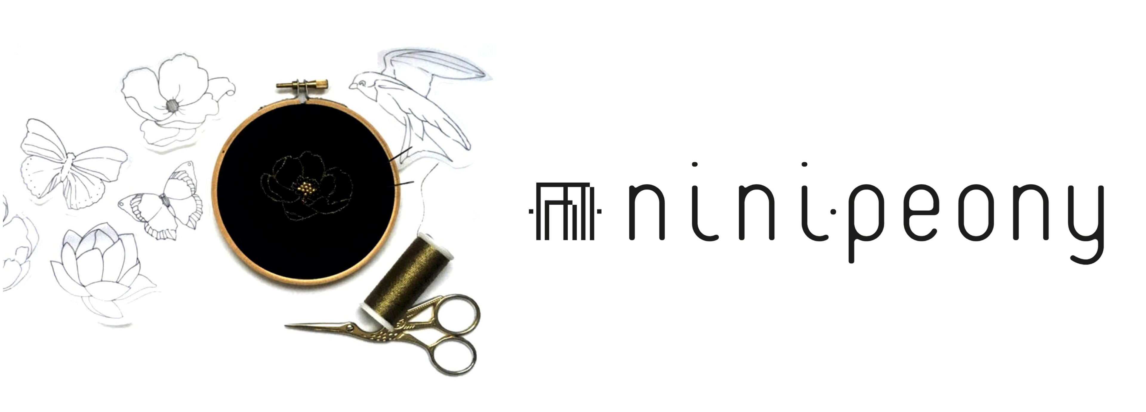
Nini Peony is a brand created by the french artist Inès Carratié. First of all we met her in her studio in Paris.
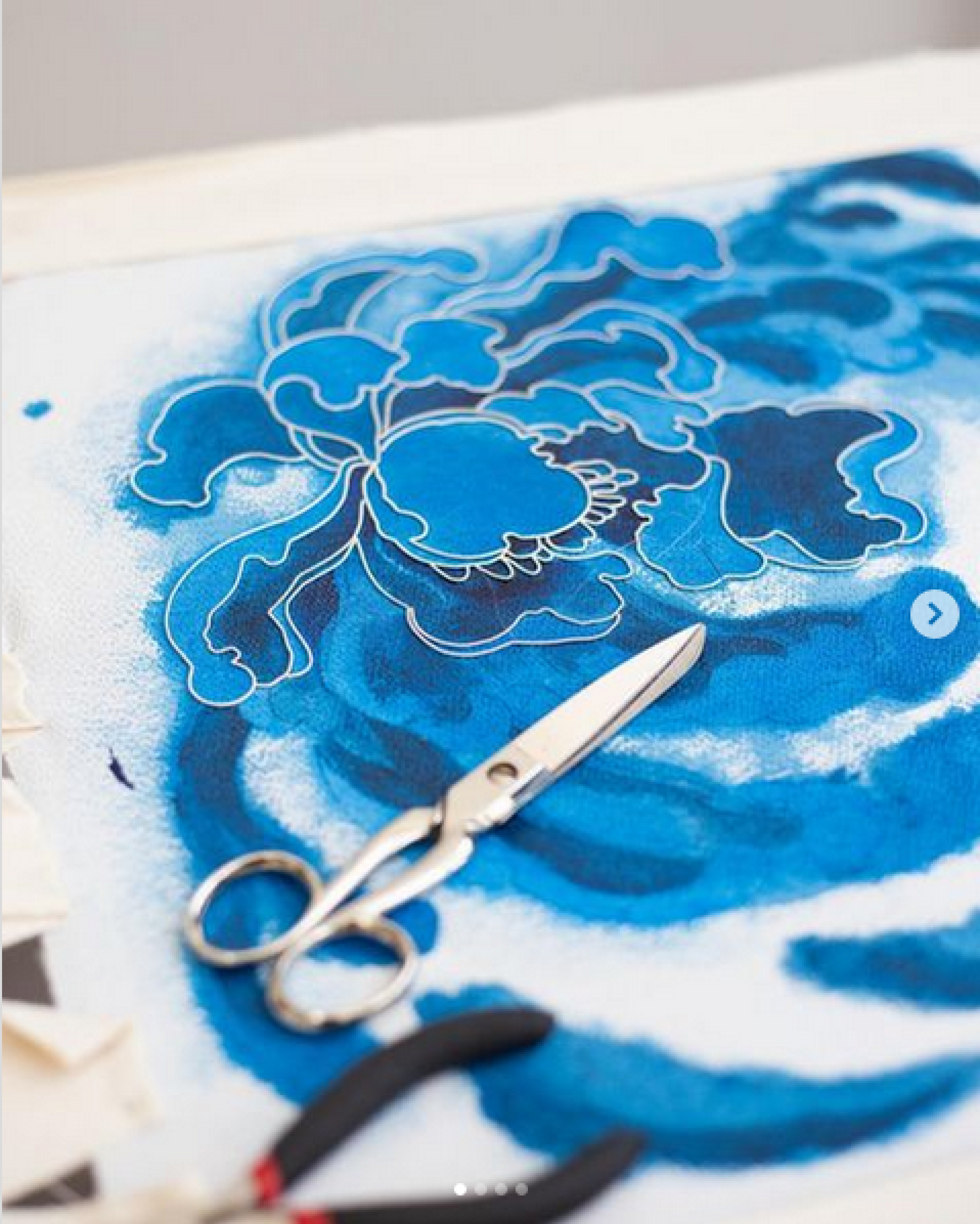
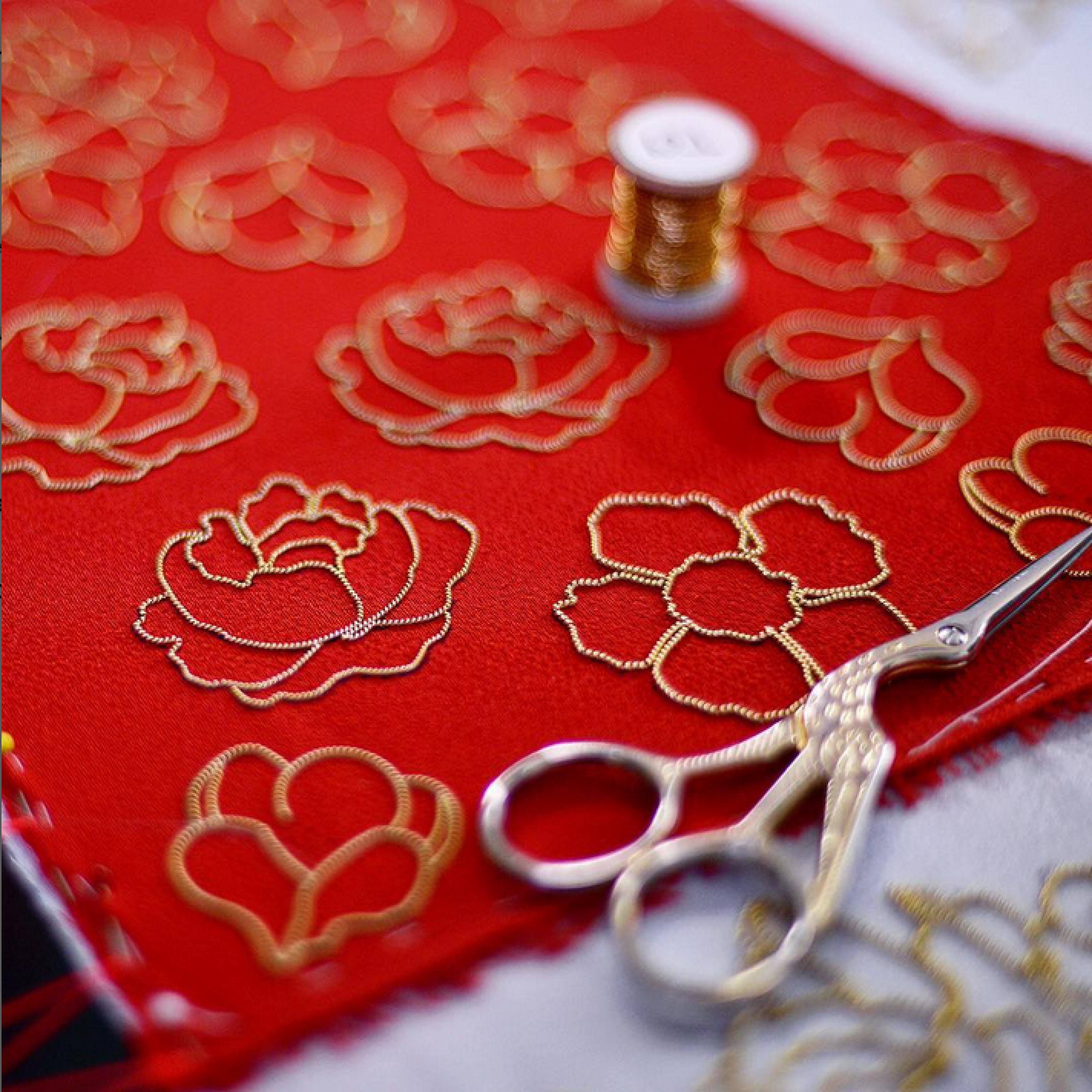
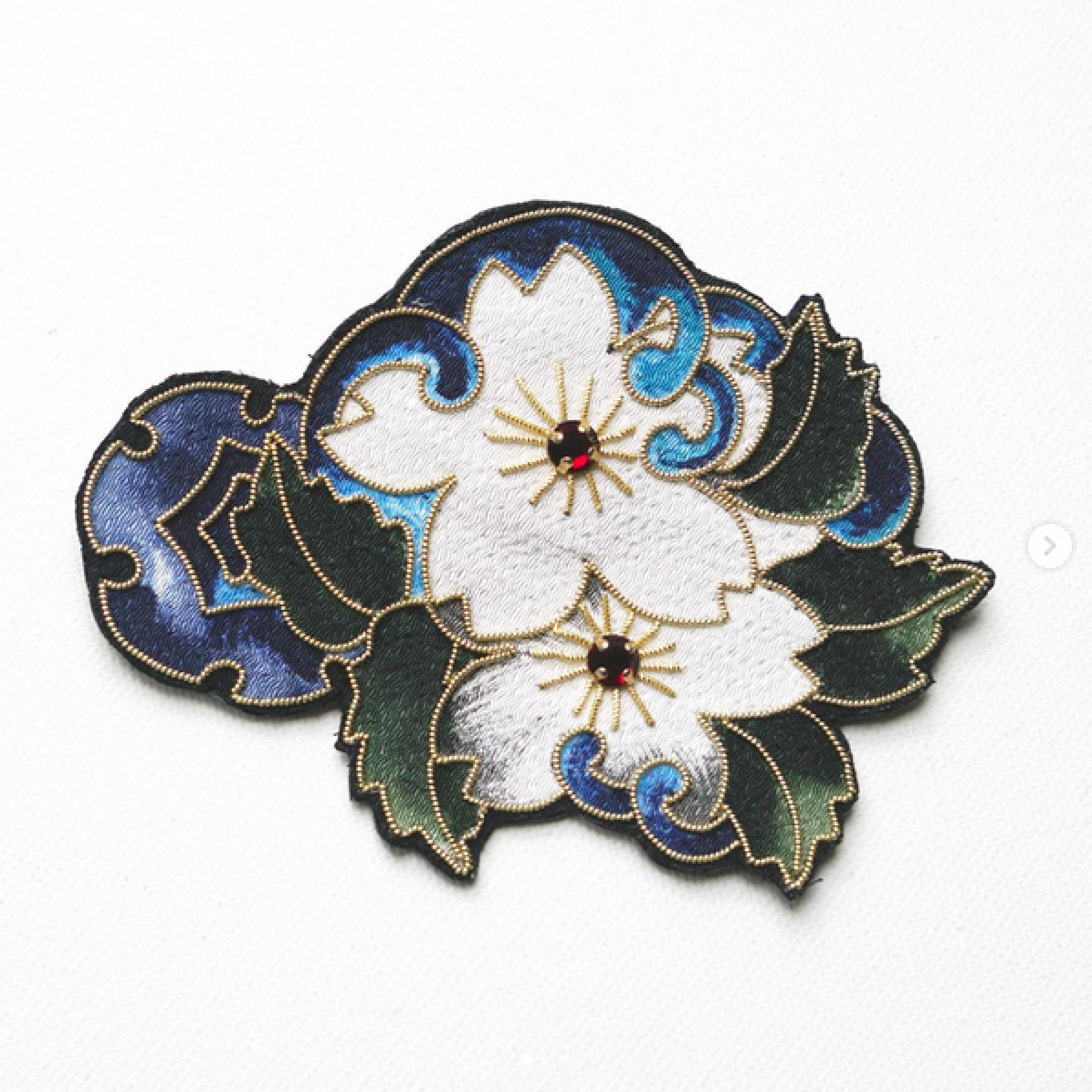
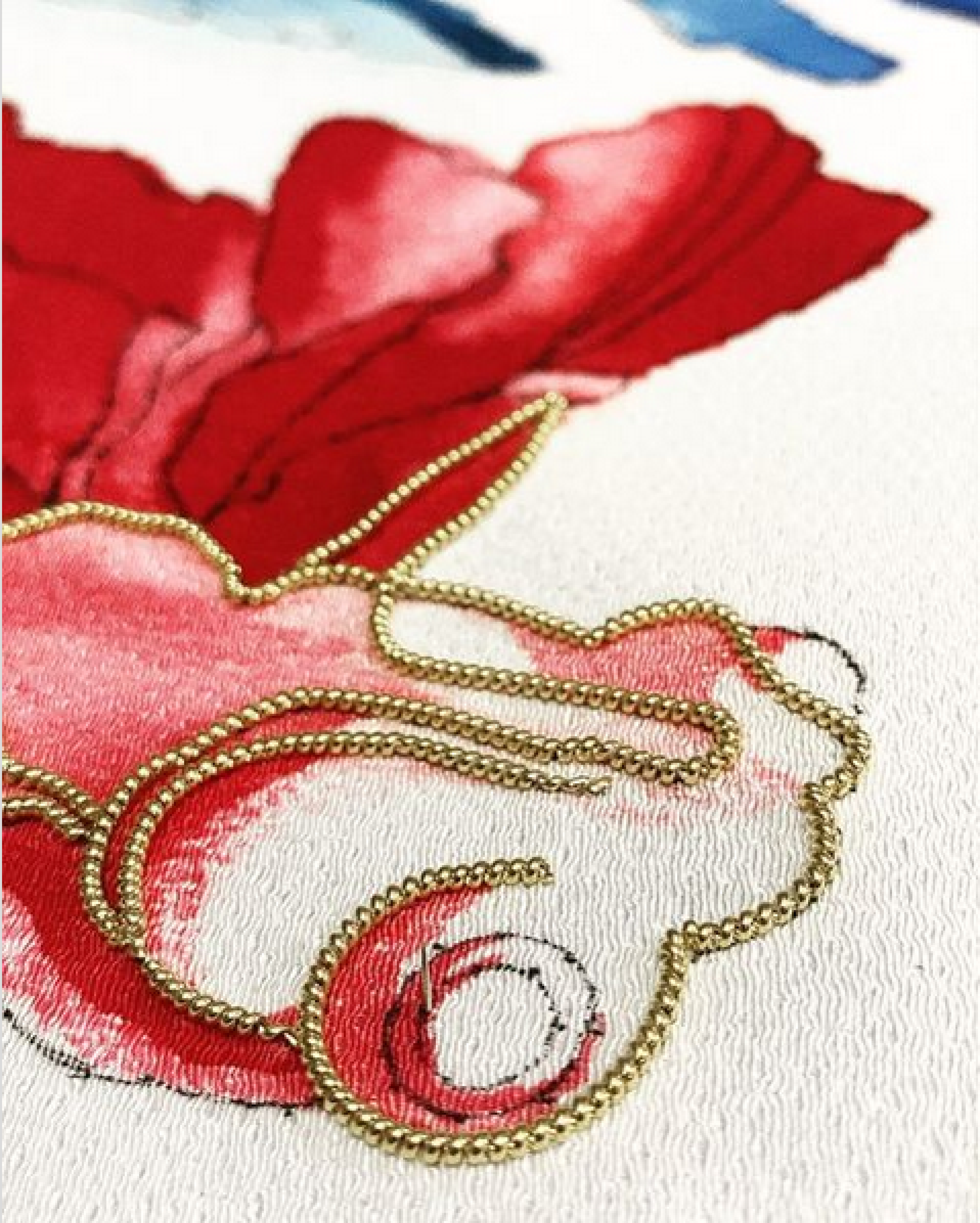
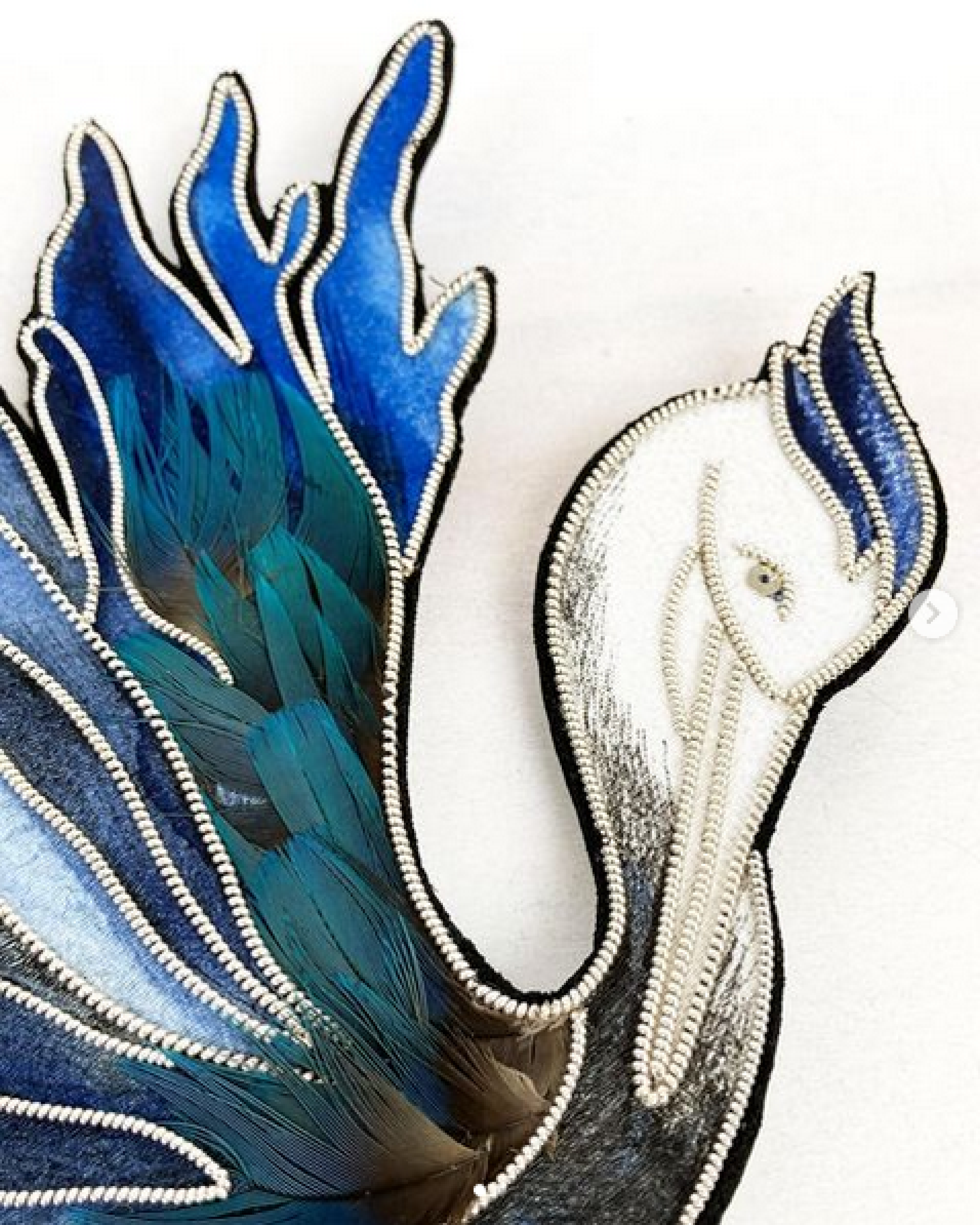
It was a very important and rich moment of exchange. She told us a lot about her universe, her technique. She makes handmade embroidery jewels, with the precious technique of gold embroidery. Each piece requires many steps, precious materials and a lot of savoir-faire.
She is a member of the prestigious “Ateliers d’Art de France”, a recognized distinction in the art craft industry.
© Inès Carratié

First Interview
During this exchange, we identify two major pain points :
- She wants to increase the sales on her website, because they only represent a small part of the general sales.
- She wants to develop tailor made projects.
Marketing research
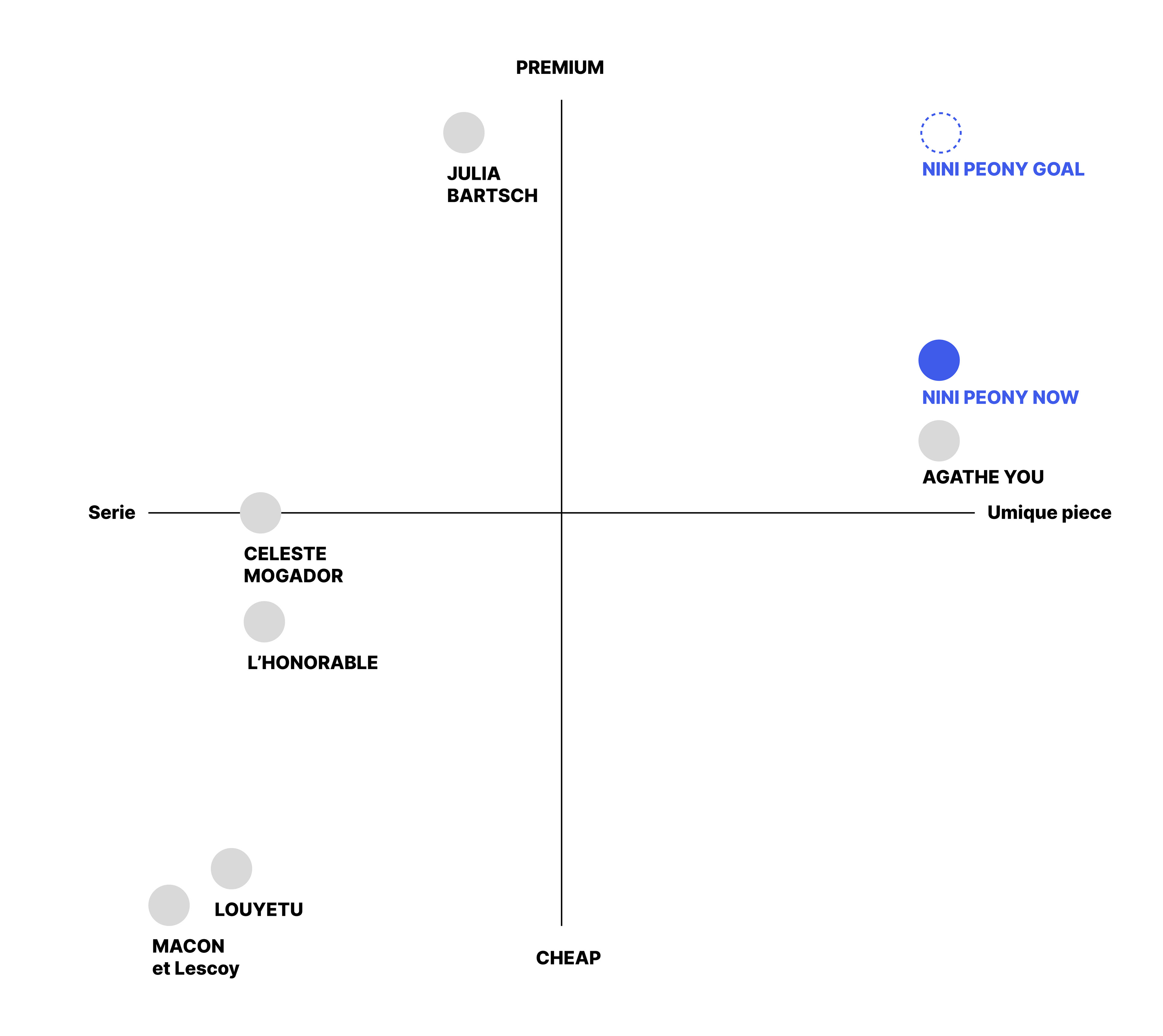
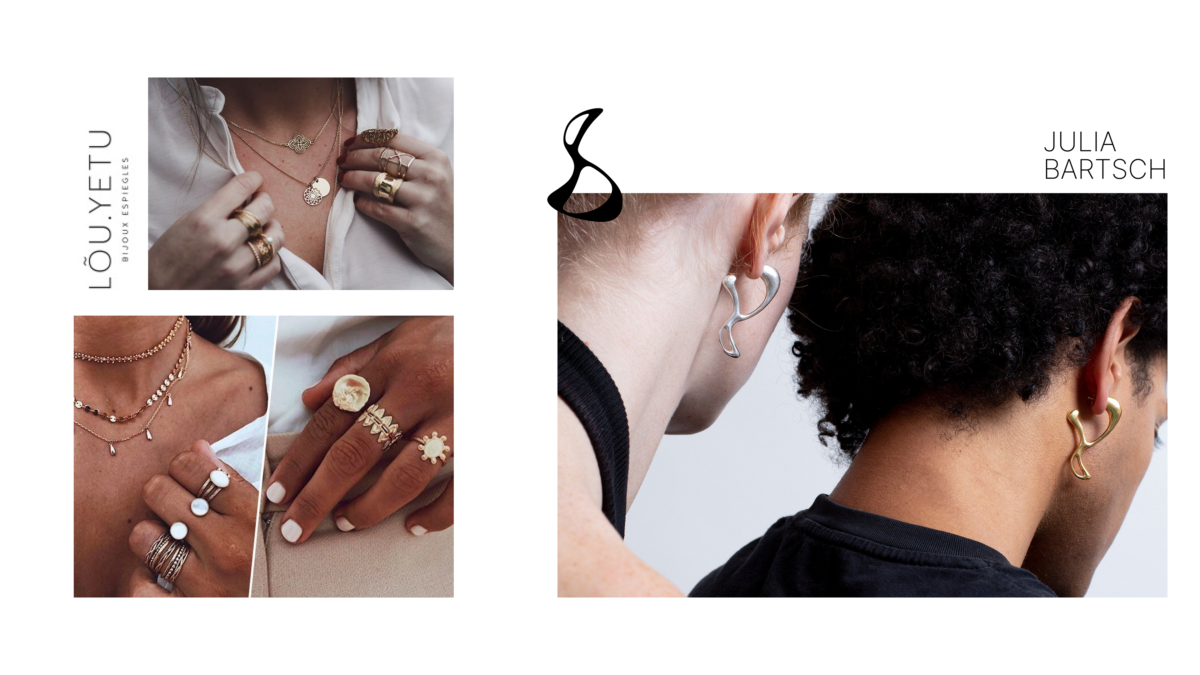
Now, let’s see how this brand takes place on the market. We compared Nini Peony to its direct competitors (embroidered jewels) and indirect competitors (jewelry brand).
It appears that Nini Peony is a very premium brand, at the crossroads between “Premium” and “unique pieces”. So, our first assumption is that the stakeholder needs a website that reflects this brand image.


Proto Persona
According to our previous research and considering the customers of our artist, we target women in their fifties, in an upper socio professional category who are sensitive to art and craft. They are looking for singularity and they are ready to put the budget on a unique or custom piece.
Existing website
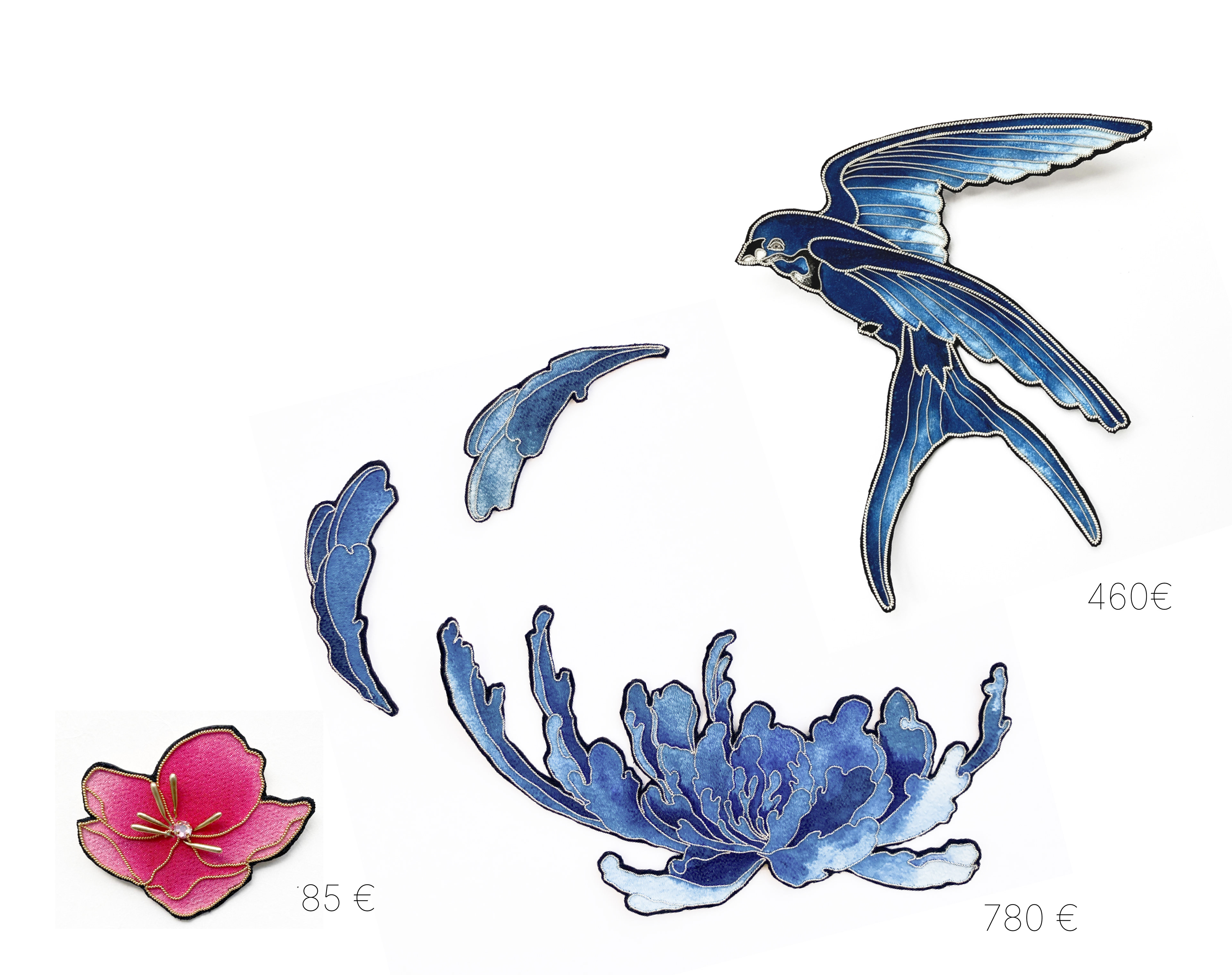
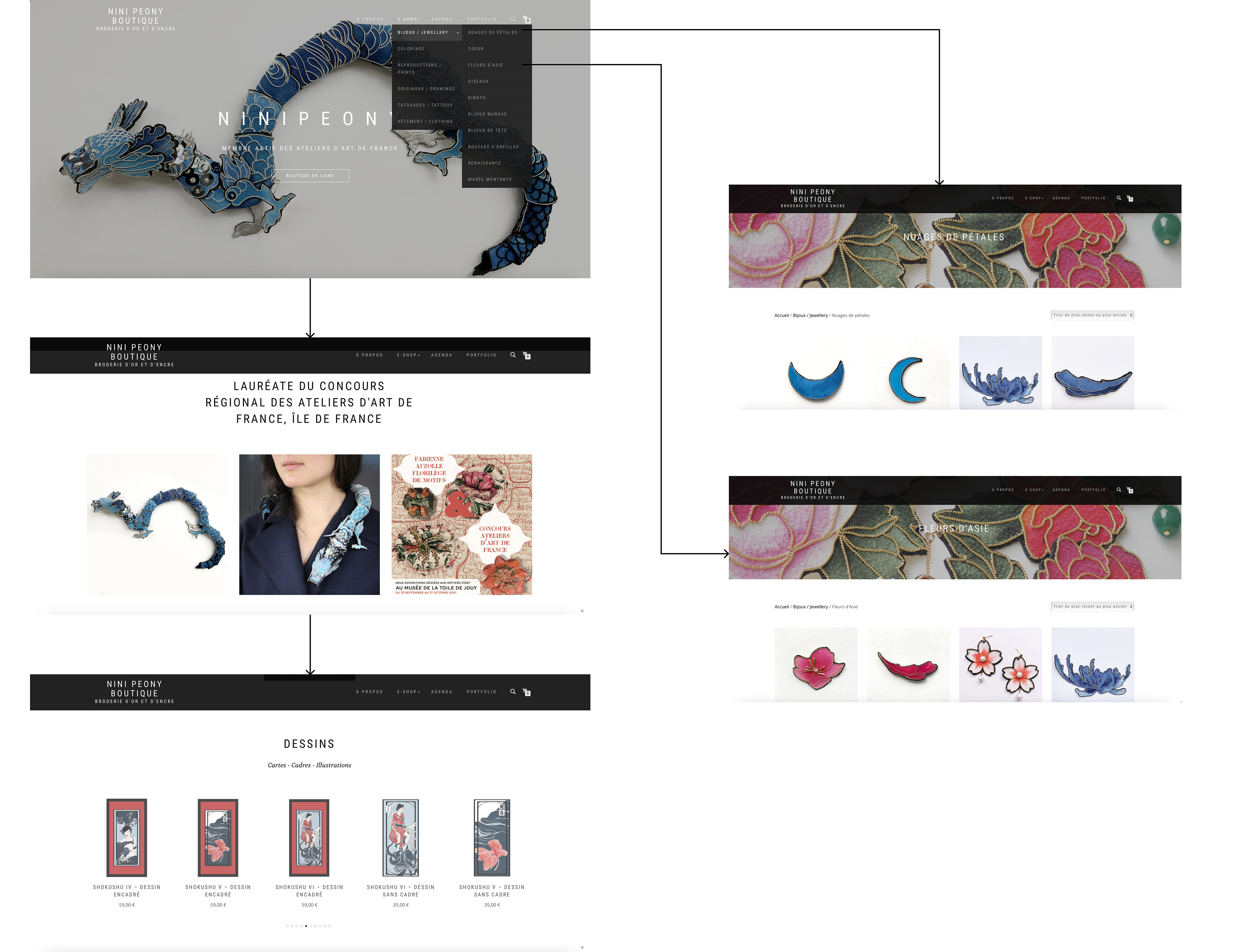
When you open the website of Nini Peony, first you see the homepage with some photos and an indication that she won the competition of Ateliers d’Art de France. Then, by scrolling you can see a category of new arrival for the jewelleries. By scrolling again, you can see a category of drawings. If you focus on the top bar, we can see a menu with the e-shop. If you go to this section, you can see that the jewelleries are classified according to several themes like “Nuages de pétales” or “Fleurs d’Asie”. In the e-shop section, you can discover other categories with her drawings (originals and prints), some temporary tattoos and coloriage.
Heuristic analysis
During our analyze of the existent website, we picked up the main pain points that we would like to solve :
- The confusion about the different products selling in the e-shop (jewels and artwork)
- Jewelry is not highlighted enough
- There is a bad categorization of the jewelries
- We don’t feel the premium image that the creator wants
- The buying flow is complicated so the customer doesn’t feel confident.
These pain points were the basis for writing our problem statement
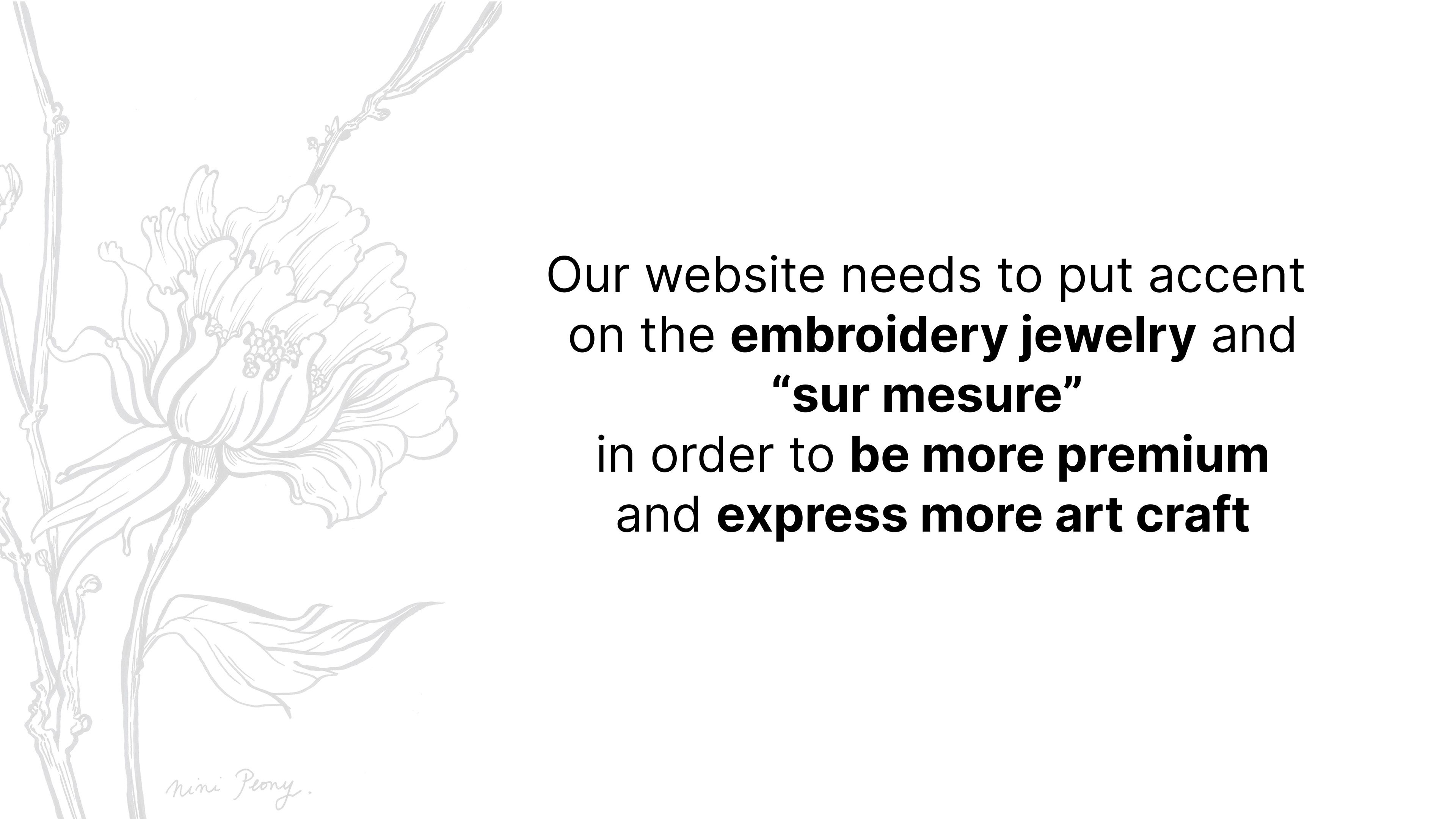
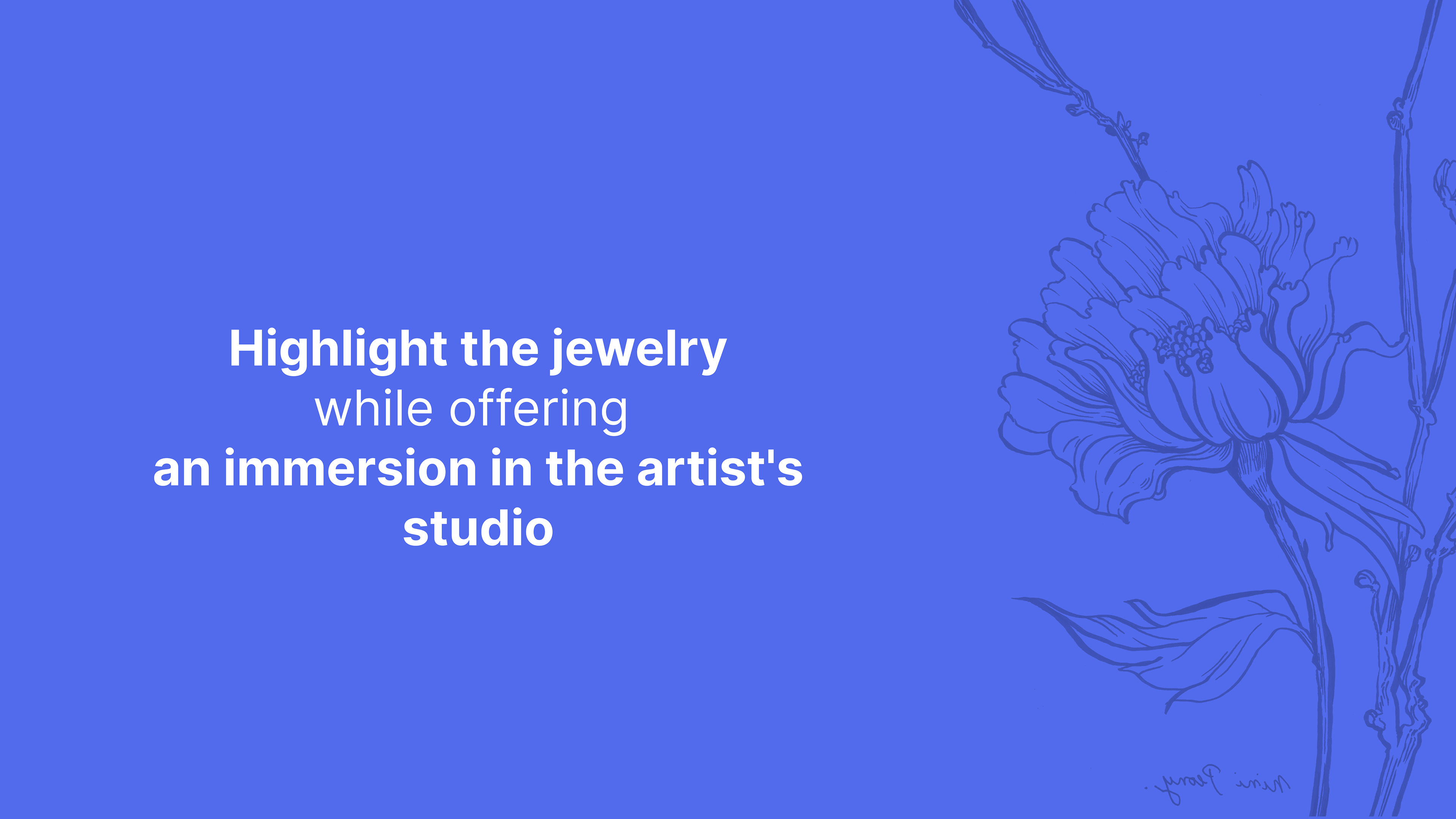
Solution pitch
The solution that we found at this step and that drive us in the continuation and development of research is :
Users testing insights
We did a mid-fi prototype that we tested with some users. These users corresponded to our persona so their feedback was very relevant for the next steps.
To agree with our positioning, we ask them to do the flow according to the buying of jewelry.
We identified some patterns according to our solution to classify our data :
- About the premium image we’d like to show on the website , it was validate with a 5/5
- The categorization of jewelries was more clear with our prototype- They felt confident with the buying process so again, 5/5 for our prototype.
We had patterns about suggestions and comments from them, about the flow and the all context of buying a jewels :
- The users need to have more content about the creator.
- They need more clarity about the delivery process.
- They need more explanation about the custom service and tailor made.
- These tests were very relevant to evolve our mid fi prototype to hi fi prototype.
Brand attributes
Before starting the Hi fi prototype, we highlighted the all universe of Ninipeony through adjectives :
Artisanal
High quality
Extreme oriental
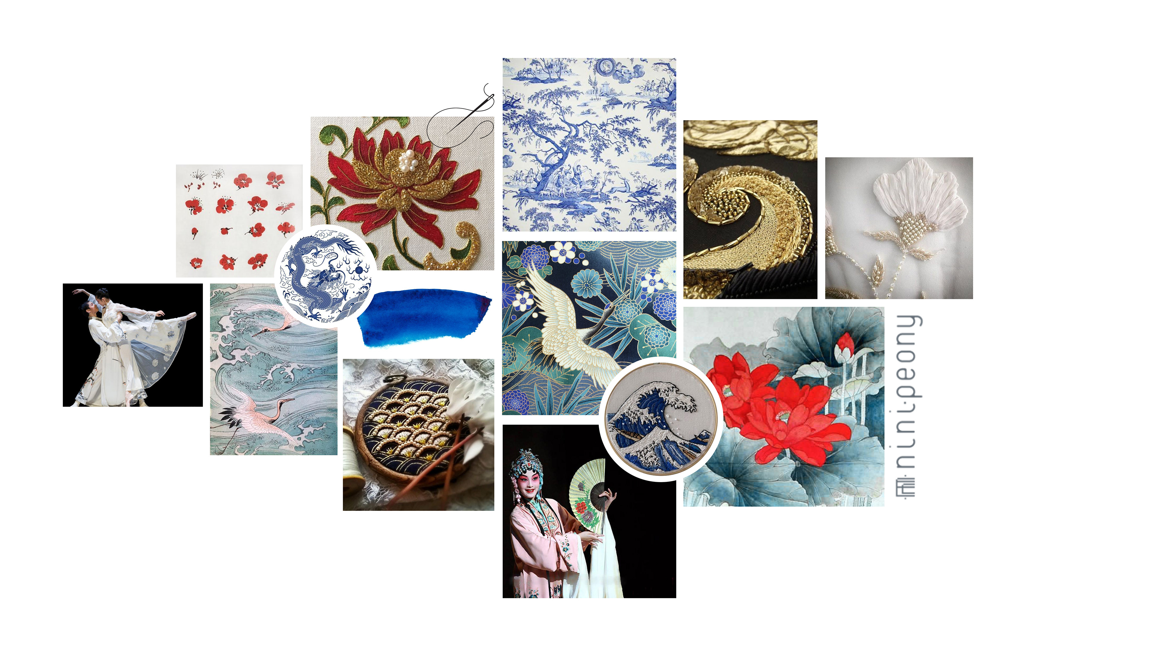

We built a moodboard according to our brand vision. That moodboard is composed with some inspirations of Asia and more particularly China and Japan (with estampes, ink, embroidery and porcelain with patterns). We also illustrate an opera that inspired the name of Nini Peony.
There are main colors representing the mood, the atmosphere and the universe of Nini Peony.
According to our moodboard, we choose two main colors for setting up the e-shop in a Hi Fi prototype :
- The Blue one will be the primary color.
- The Red one will be the functional color.
Hi fi flow
Discover our Artist and her technic
We decided to show the flow of the user when wanting to buy an embroidered jewel.
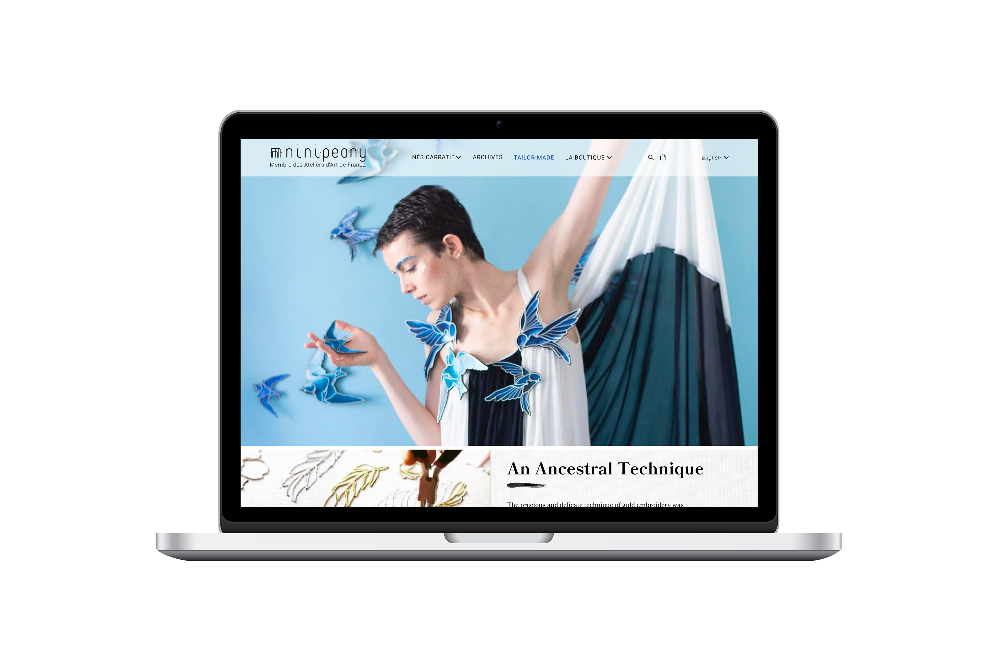
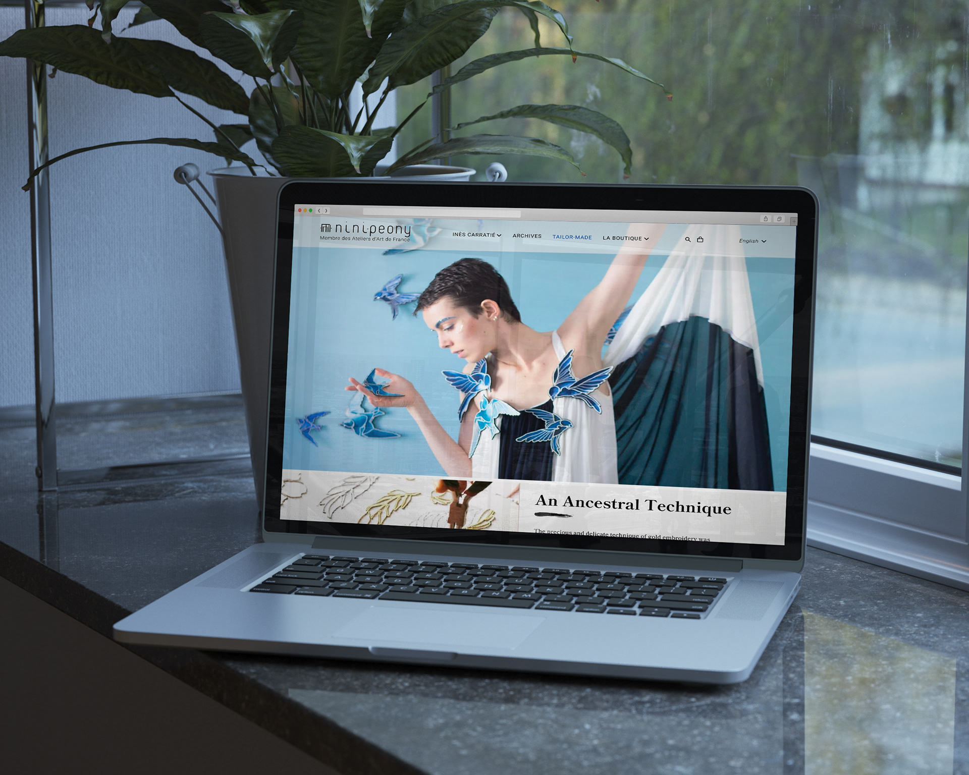
Homepage
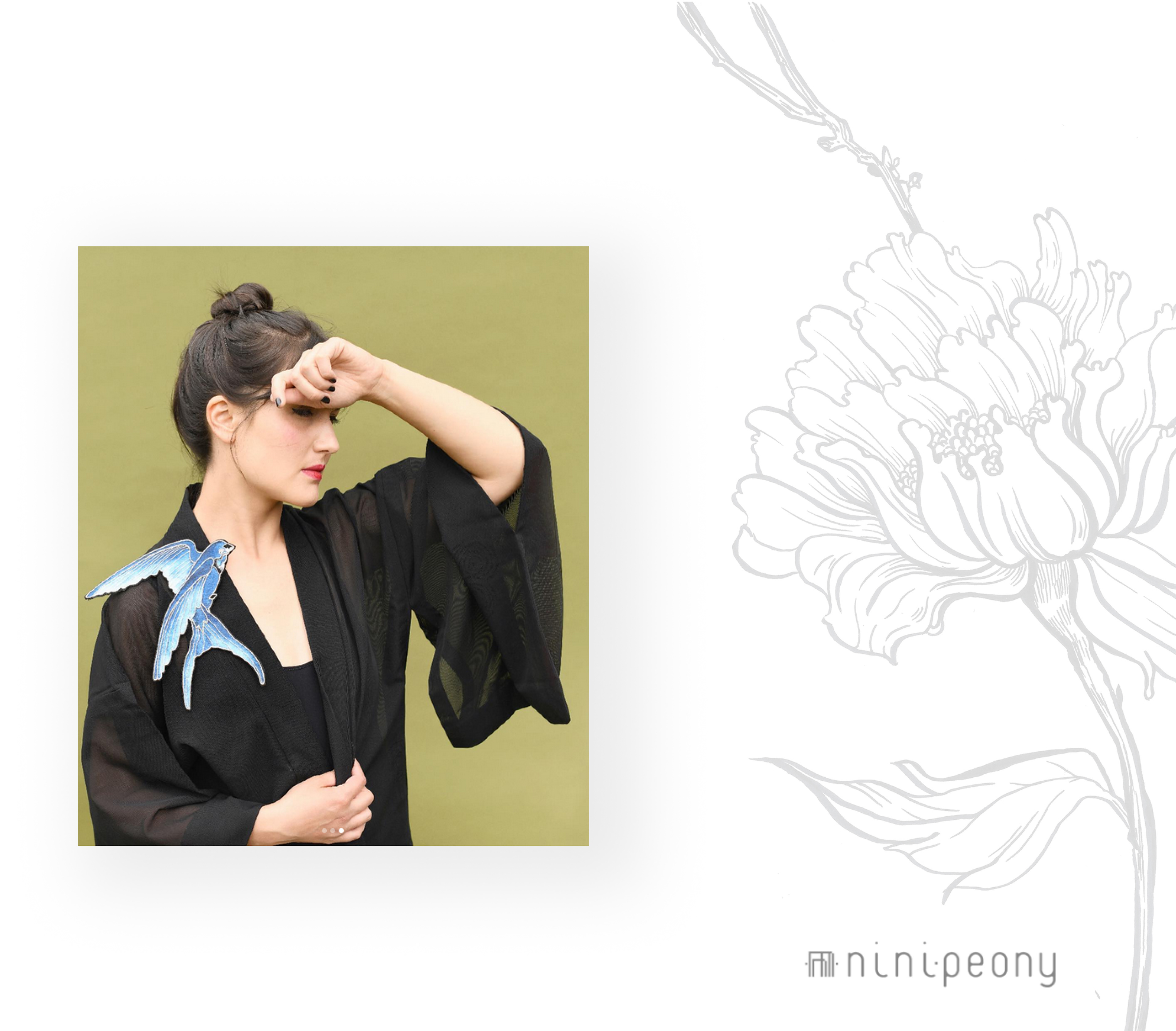
When we arrive on the website, we are directly immersed into the artist’s universe.
We have a hero-image in which we can see multiple perspectives of the product and a nice staging between them and the model. At this point, the user has a glimpse of the look and feel of the product he is going to see on the website.
On the upper part, we have the menu bar. It is written in a Non-serif font, because it offers clarity and readability.
On the left side of the menu, we have the logo of the brand, Nini Peony, along with the label “membre des Ateliers d’Art de France” underneath it.
Welcome to the artist studio
When we start scrolling, we discover the technique and process behind the embroidered jewelries. We learn about ancestral technique and how Ines made a modern interpretation of the jewels using this technique. That’s why for the texts inside the website, we went with a Serif Font which translates both the elegance and the tradition of the brand.
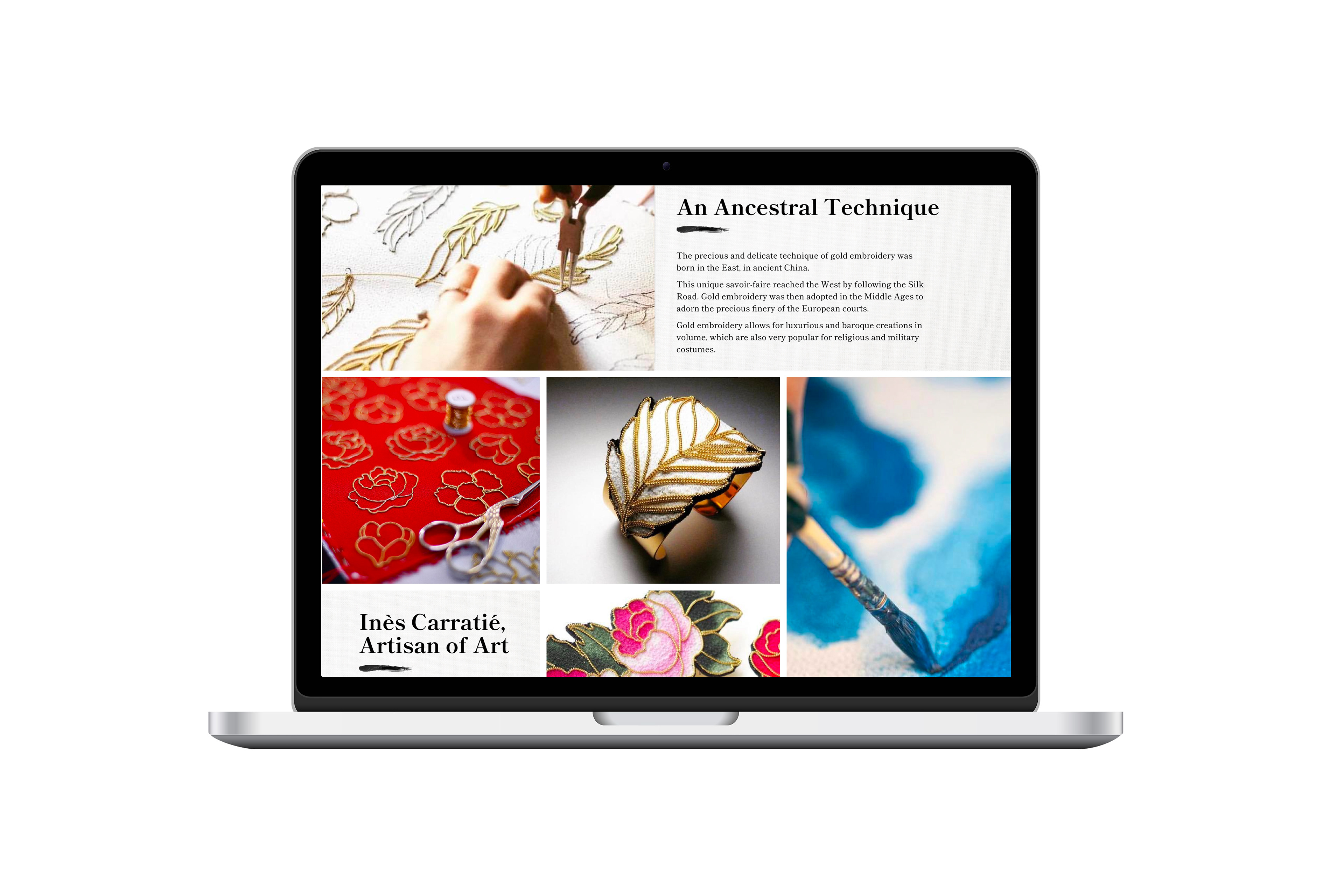
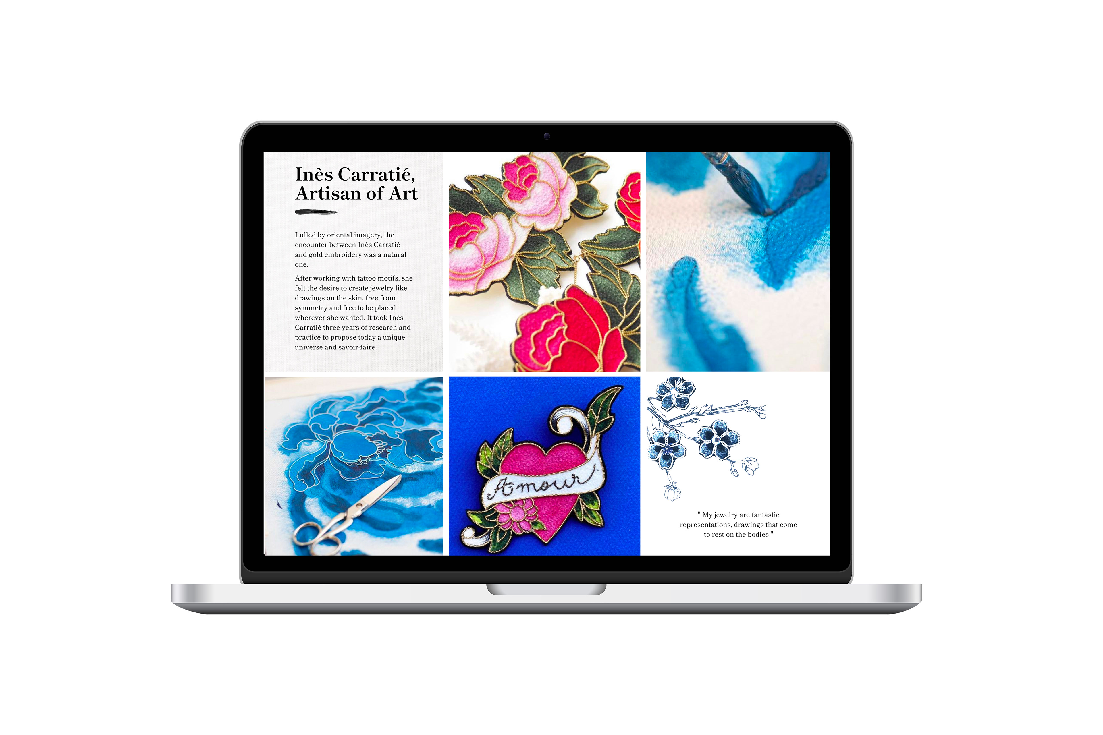
Along with the text, we also have a mosaic of visuals. One of the people we interviewed quoted “if it’s a hand-made brand, I need to see the artist create with her own hands”. That’s why you will see big close-ups on the paintings, the scissors etc…
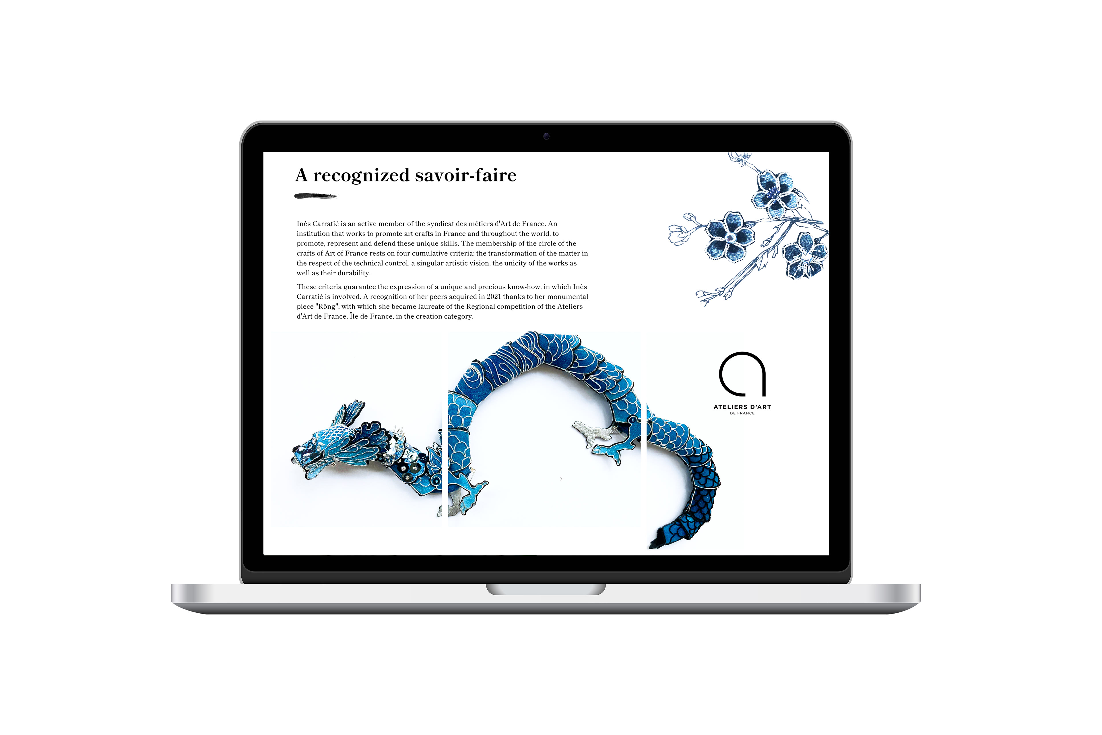
"Savoir-faire"
When we continue scrolling, we arrive in the know — how section. The interviewers were very impressed when they knew that she was a member of les Ateliers d’Art de France and it added a great value to her work as an artist.
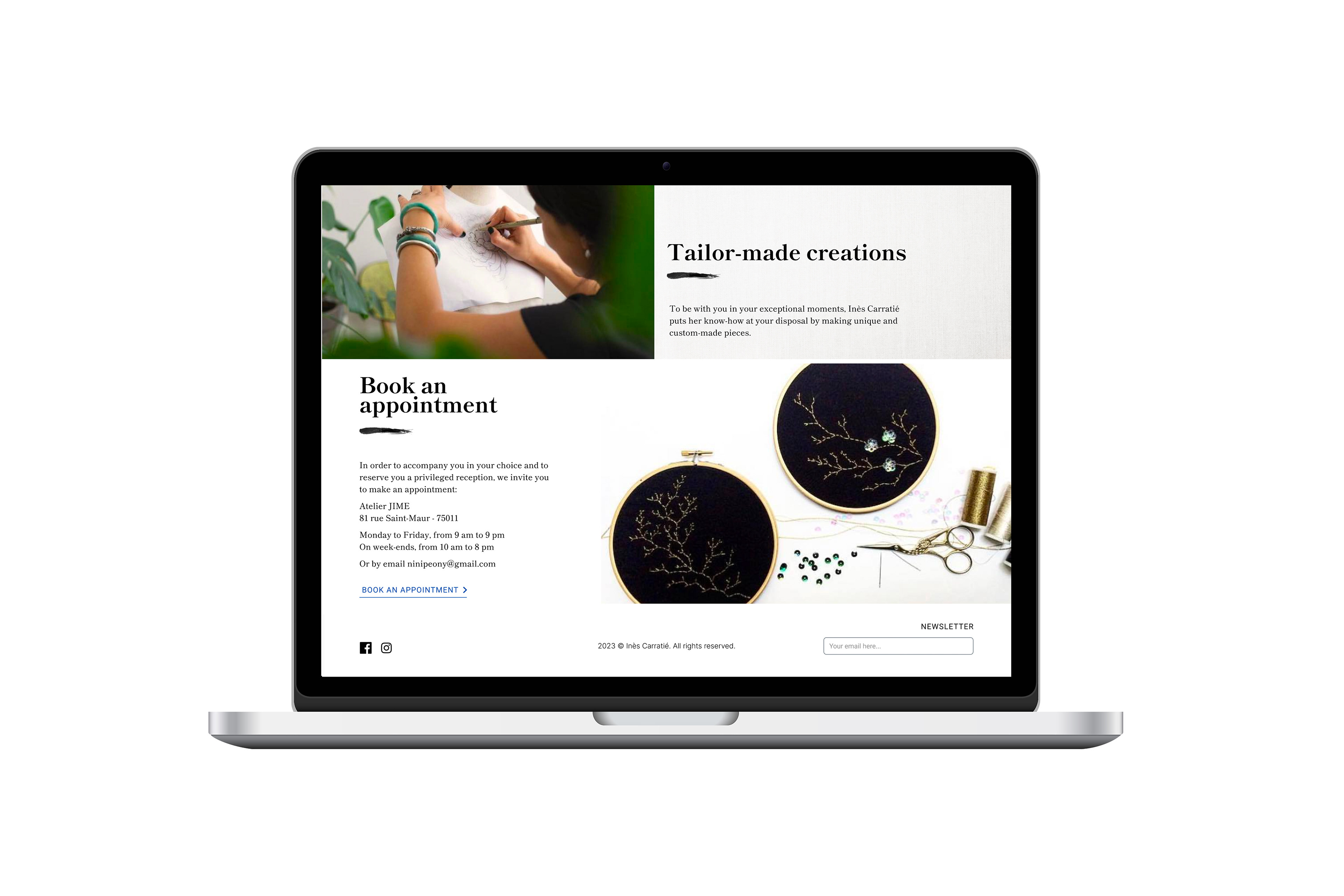
Tailor-made
We then arrive at the tailor-made creations. We offer the user the possibility to book an appointment and it emphasizes the premium side of the brand, the tailor’s work, and the uniqueness of every jewelry.
And finally, on the bottom we have the footer with the social media icons on one side, and the subscription to the newsletter on the other side.
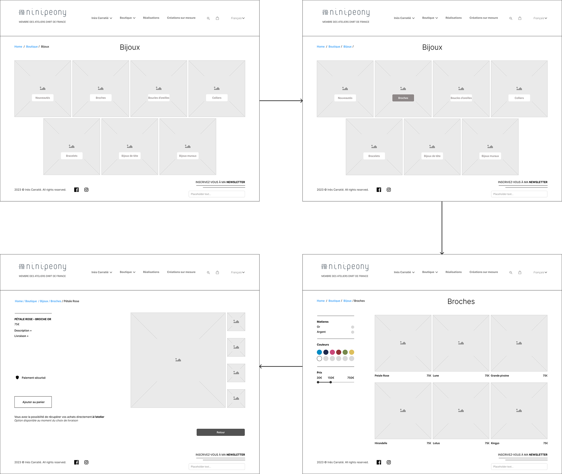
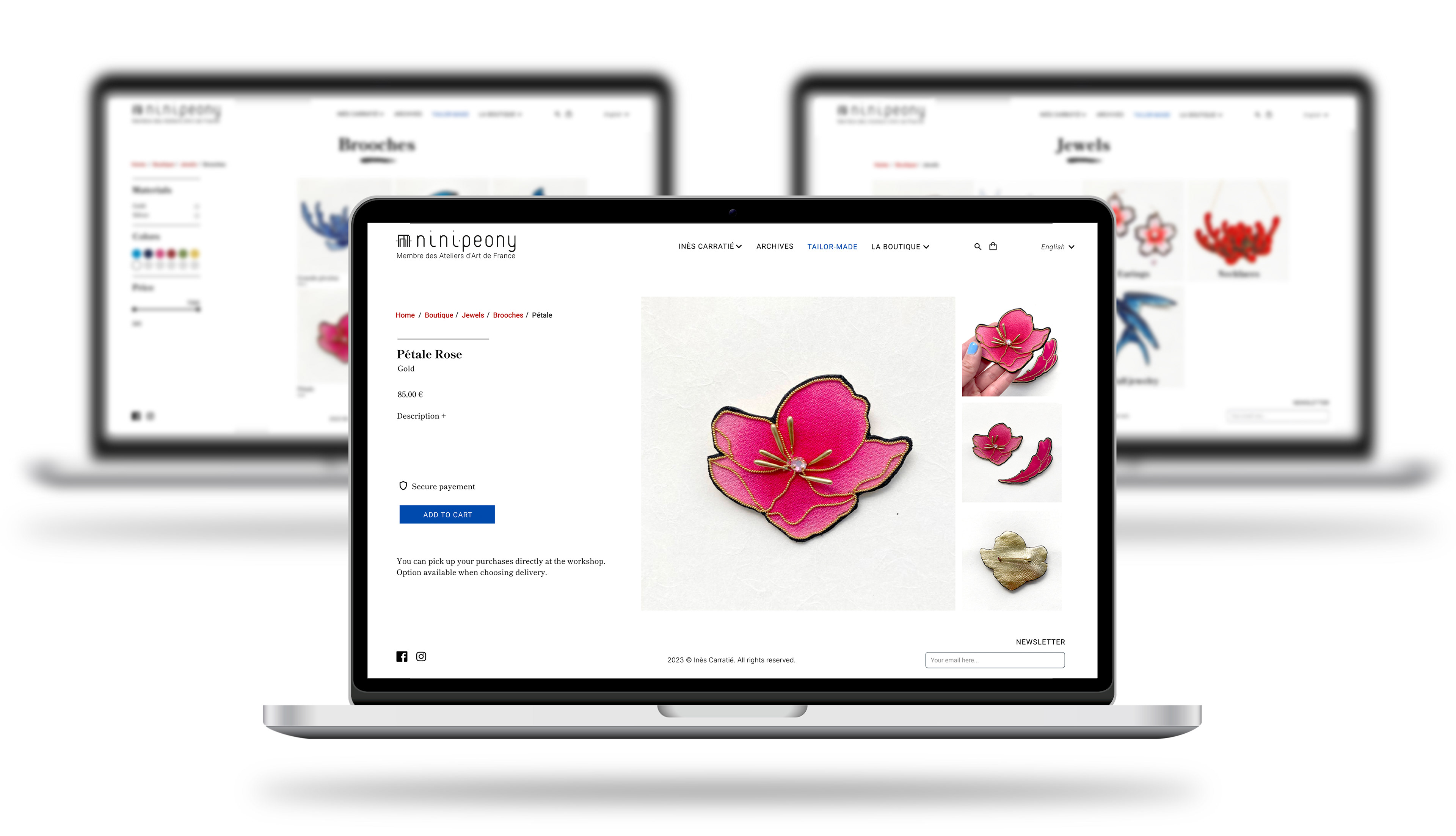
E-shop
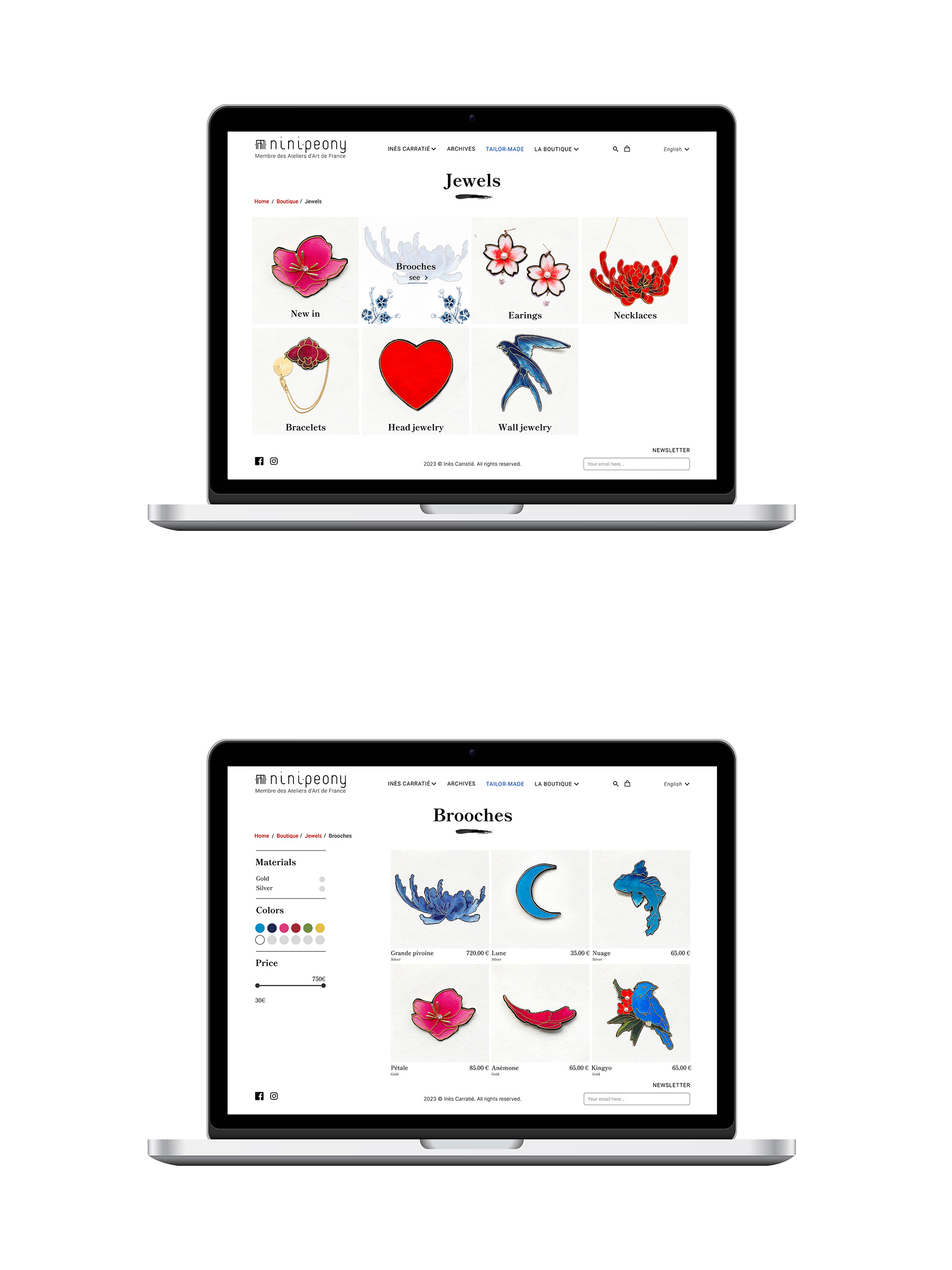
When we click on “la boutique”, we have a drop down menu unrolling where we can select the section that interests us: In that case we want to check the jewels.
We arrive at the section of the Jewels. We re-organised the content and compartmentalized them by functions. That gave us 7 sections :
The new-in, the brooches, the earrings, the necklaces, the bracelets, the head jewelry and finally the wall jewelry.
The new-in, the brooches, the earrings, the necklaces, the bracelets, the head jewelry and finally the wall jewelry.
When we are mousing-over the section that interests us, we have the animated asian illustrations from the creator appearing so that it gives the dreamlike feeling we want. We decide to click on it and we arrive on the Brooches product page. Here we have all the brooches on the right side, which we can filter by materials, colors and price.
Product selection
Once a product has caught our eye, we can select it and we arrive on the cart page where we can see the content inside. In parallele, a little notification appears on the top side of the page, at the position where we have ou cart icon.
We click on Validate to continue to the next page and we arrive on the information page where we can fill in with our personal infos. Once the form completed, and if there is no any error from the user, we validate and continue and the payment page where we can choose the payment method that arranges us. You can also leave a nice note if the jewel is supposed to be a gift.
Once paid, we have a confirmation page precising that your purchases has been completed.
Next Steps
Our to do list for the next steps is :
- Present the hi-fi to the artist
- Take her feedback
- Recommand her to add more content in the “About her” section
- Focus on photos to support the premium image
- Develop on tailor-made section